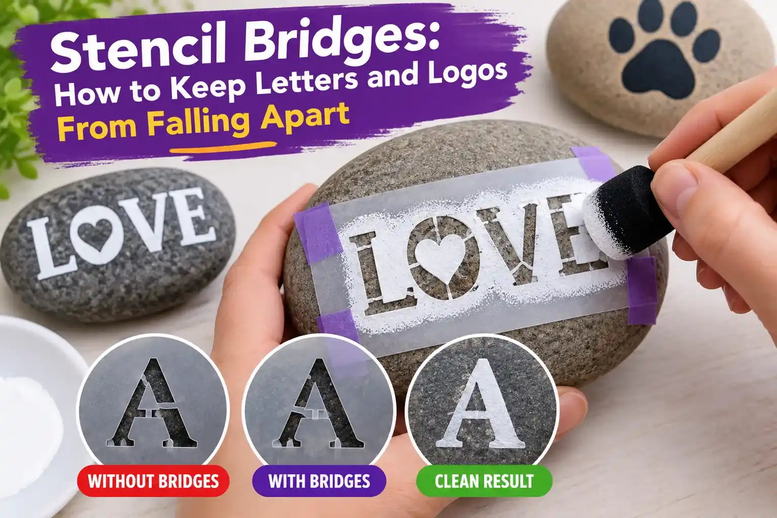
Stencil letters often fail for one simple reason: the design looks correct on screen, but the center of a letter such as O, A, B, D, P, Q or R has nothing physically connecting it to the rest of the stencil sheet. When the design is cut, that inner piece—often called an island—falls away.
The fix is a stencil bridge: a deliberate strip of uncut material that connects an enclosed island to the outer stencil. Good bridges keep the stencil in one piece without making the finished lettering look clumsy.
What Is a Stencil Bridge?
A stencil bridge is a narrow connection left between an enclosed shape and the surrounding stencil material. It is most common in letters, logos and detailed image stencils.
For example, the middle of the letter O is completely enclosed. If you cut the entire O outline with no bridge, the center drops out. A bridge holds that center in place so the stencil can be lifted, reused and painted repeatedly.
Which Letters Usually Need Bridges?
Any letter with a fully enclosed counter usually needs at least one bridge when the design is intended to remain a single reusable stencil sheet.
- A
- B
- D
- O
- P
- Q
- R
Numbers such as 0, 4, 6, 8 and 9 can have the same problem depending on the font. Logos may contain even more islands than text.
What Happens If You Forget the Bridges?
The cutter can still complete the job perfectly, but the stencil itself may become unusable. The center pieces fall away, changing the design. An O can become a solid circle, a B can lose both counters, and a logo can lose small internal details.
This is a design problem rather than a machine-settings problem. Changing blade pressure, laser power or cutting speed will not reconnect an island that was never bridged in the artwork.
How Wide Should a Stencil Bridge Be?
There is no universal bridge width because the correct size depends on material thickness, stencil size, cutting method and how many times the stencil will be handled.
As a practical starting point, very small single-use adhesive stencils can use thinner bridges, while reusable Mylar stencils normally need wider and stronger connections. The bridge should survive cutting, lifting, washing and painting without tearing.
A recent stencil-design guide makes the same point: bridge thickness must balance structural strength against visual interruption.
Where Should Bridges Be Placed?
Place bridges where they preserve the character of the letter or logo while remaining visually unobtrusive. Common locations include:
- the left and right sides of rounded letters;
- the top or bottom of enclosed counters;
- existing horizontal strokes;
- areas where a small paint gap is easy to touch up afterward.
Two smaller bridges can sometimes look more balanced than one very large bridge, especially on O, D and rounded logo elements.
How to Add Bridges to Text Manually
- Convert the text to outlines or paths in your design software.
- Identify every enclosed island.
- Draw a small rectangle or connector across the cut opening.
- Merge that connector with the part of the stencil that must remain.
- Preview the final negative space before exporting.
- Zoom in and check that no island is left completely surrounded by a cut line.
Stencil Fonts vs Regular Fonts
Stencil fonts already include bridges in the letterforms. They are the fastest option when you need simple cut-ready text. Regular fonts can still be used, but enclosed letters usually need manual bridge work before cutting.
If you are creating names, signs or labels, our free Stencil Maker can help convert artwork into a high-contrast stencil-ready form before you refine the final bridges.
How to Add Bridges to Logos
Logos are more complex because islands are not limited to letters. Look for any white or black region that will become completely detached after cutting.
A useful workflow is:
- Convert the logo to a clean black-and-white design.
- Remove tiny details that will not cut reliably.
- Identify all floating islands.
- Add structural bridges at visually quiet locations.
- Test the design at the final physical size.
Do not judge the artwork only while zoomed in on a large monitor. A bridge that looks thick on screen may become extremely fragile when the stencil is reduced to a few inches wide.
Bridges for Laser-Cut Stencils
Laser cutting can reproduce fine detail, but the heat-affected width of the cut, material thickness and the final stencil size still limit how narrow a bridge can be. Very thin connections can warp, melt or break during use.
For laser projects, see our vector conversion for laser cutting guide and laser cutter settings for stencils.
Bridges for Cricut and Other Cutting Machines
With Cricut-style cutting machines, material choice matters as much as the design. A bridge that survives in adhesive vinyl may be too weak in reusable plastic. Blade condition, mat grip and intricate-cut settings also influence whether small connectors lift during cutting.
If small sections tear or fail to release cleanly, our Cricut stencil cutting troubleshooting guide covers the machine-side causes.
How Bridges Affect the Painted Result
Every bridge leaves an unpainted gap in the finished shape. This is normal. You can either keep the classic stencil appearance or touch up the gap afterward with a small brush.
For signs and industrial-style lettering, visible bridge gaps often look intentional. For decorative logos or portraits, place bridges where the final touch-up will be easy.
Common Bridge Mistakes
- Bridge too thin: it tears during cutting, cleaning or painting.
- Bridge too wide: it noticeably changes the letter shape.
- Only checking letters: logo icons can contain islands too.
- Designing at the wrong scale: a safe bridge at 12 inches may fail at 3 inches.
- Adding bridges after export: late edits can create overlapping paths or duplicate cut lines.
Bridge Placement Checklist
Before exporting a stencil, confirm the following:
- Every enclosed island is connected.
- Bridge width matches the final size and material.
- No bridge crosses an important visual feature unnecessarily.
- The design still reads correctly from normal viewing distance.
- There are no duplicate or overlapping cut paths.
Frequently Asked Questions
Why does the middle of my O fall out?
Because the center is a fully enclosed island. Add one or more bridges connecting it to the rest of the stencil.
Do all stencil letters need bridges?
No. Letters without enclosed counters, such as E, F, H, L, M, N, T and many others, can often be cut without bridges.
Can I use a normal font for a stencil?
Yes. Convert the text to paths and add bridges wherever an enclosed island would otherwise fall out.
Are bridges necessary for adhesive vinyl stencils?
Sometimes less so, because transfer tape and adhesive can temporarily hold loose pieces in position. Reusable one-piece stencils, however, generally need structural bridges.
Bottom Line
Stencil bridges are structural, not decorative. They keep enclosed islands attached so letters and logos remain usable after cutting. Add them before export, size them for the actual material and final dimensions, and test the smallest details before committing to a large cut. A few well-placed bridges can turn a design that falls apart into a durable, reusable stencil.
1 thought on “Stencil Bridges: How to Keep Letters and Logos From Falling Apart”
Comments are closed.