Introduction
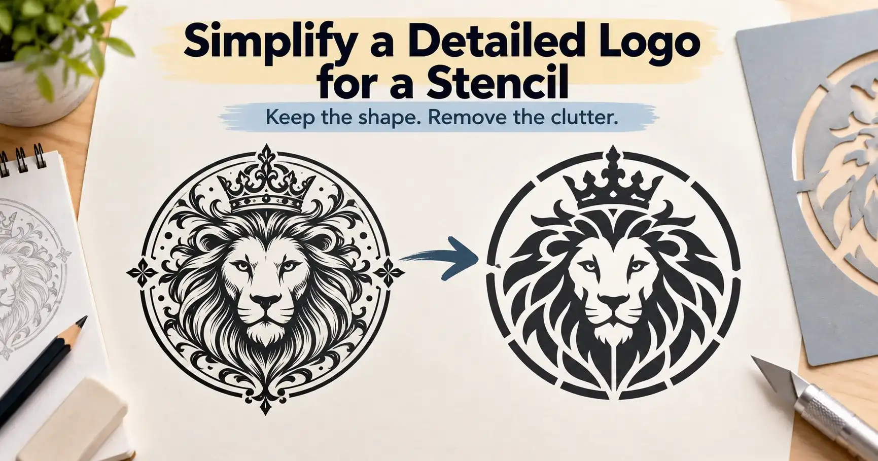
A detailed logo can look great on screen but become difficult to cut and paint as a stencil. To simplify a detailed logo for a stencil without losing its shape, focus on preserving the main silhouette, recognizable features, and important negative spaces while removing tiny lines and unnecessary details. The goal is to create a cleaner design that stays strong during cutting and still looks like the original logo. With the right balance of simplification, bridges, spacing, and contrast, you can produce a stencil that is easier to use and remains visually recognizable.
Start with recognition, not with every tiny detail
A detailed logo can look perfect on a screen and still fail as a physical stencil. Thin lines disappear, enclosed shapes fall out, tiny gaps close during cutting, and gradients turn into muddy blocks. The goal is not to copy every pixel. The goal is to preserve the features that make the logo recognizable after it becomes a two-part system: areas that stay and areas that are cut away.
A good stencil version should still read correctly from the distance where it will be used. That may require removing texture, thickening narrow shapes, opening cramped gaps, and adding bridges to enclosed areas. If you are starting from a raster image, the PNG to SVG stencil guide explains how to get cleaner vector edges before you simplify the artwork.
Why complex logos fail when converted directly
Logos often contain information that works in print but has no structural support in a stencil. Common trouble spots include hairline strokes, small counters inside letters, overlapping shapes, shadows, gradients, distressed textures, and closely spaced elements. A cutting machine or laser may reproduce the path, but that does not mean the finished stencil will remain strong enough to use.
- Islands: enclosed pieces such as the center of O, A, P, R, B, or a closed icon can fall away.
- Weak bridges: very narrow connectors can tear during weeding, painting, or cleaning.
- Crowded negative space: tiny gaps can fuse visually after paint is applied.
- Over-detail: textures and miniature lines may cut but become unreadable at final size.
- Too many colors: a one-layer stencil cannot reproduce normal gradients or blended color transitions.
The most important decision is therefore what information the stencil must keep. A manufacturer converting complex logos for stenciling makes the same point: size, detail level, overlapping elements, and color structure all affect whether a logo can become a reliable stencil. See this complex-logo stencil preparation example for additional context.
Step 1: identify the logo’s recognition anchors
Before editing, shrink the logo to the final intended stencil size and look at it for only a few seconds. Note which features make it identifiable: the outer silhouette, one distinctive letterform, a central icon, a unique cutout, or a specific relationship between shapes. Those are recognition anchors. Protect them first.
Now separate decorative information from essential information. Fine scratches, tiny highlights, internal texture, very small text, and subtle shadows usually have lower priority than the main silhouette. If removing an element does not change what the logo is, it is a candidate for simplification.
Step 2: convert shading into clear positive and negative shapes
A practical stencil behaves like a binary graphic. Each area is either open or closed. Gradients, drop shadows, semi-transparent effects, and soft glows need to become solid shapes or disappear. Start in black and white so you can judge structure without being distracted by brand color.
For a one-layer stencil, combine nearby tonal regions into one strong mass. If color separation is essential to the identity, plan two or more stencil layers instead of forcing every color into one sheet. Registration marks can then help each layer return to the same position. The multi-layer registration guide covers that alignment problem in detail.
Step 3: fix islands before you worry about perfect curves
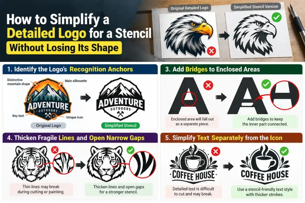
Any enclosed area that would become a loose piece needs a connection to the surrounding stencil. These connectors are bridges. They are structural, not decorative. Add them where they interrupt the logo least: along an existing straight edge, a natural shadow line, or a less noticeable part of a letter.
Do not make every bridge as thin as the software allows. A bridge that survives the cut can still tear during cleaning or bend during repeated use. The right width depends on material thickness, stencil size, and cutting process. For a deeper explanation of counters, islands, and bridge placement, use the stencil bridges guide for letters and logos.
Step 4: thicken fragile lines and open narrow gaps
Zooming in can make a fragile design look stronger than it really is. Always judge thin lines at physical size. If two shapes are separated by only a hairline gap, paint may bridge that gap even if the cutter succeeds. If a line is extremely narrow, it may buckle or disappear when the stencil is lifted.
Increase the width of critical strokes gradually. At the same time, enlarge narrow negative spaces so paint can define them. This is especially important in crests, script logos, animal fur, fingerprints, filigree, and compact badges.
Step 5: simplify text separately from the icon
Small text is often the first part of a logo to fail. If the wording is essential, use a stencil-friendly version with wider strokes and stronger counters. If it is secondary text, consider removing it from the small stencil and creating a larger version for applications where the wording can remain legible.
Do not distort the main brand name simply to save every character detail. Sometimes a separate text stencil produces a cleaner result than squeezing the icon and text into one crowded sheet.
Step 6: check the design at final size, not only at 400% zoom
Print the simplified artwork at the exact size you plan to cut. Stand at the real viewing distance. If two elements merge visually on paper, they will not improve after being cut and painted. If the icon loses its identity, restore one recognition anchor rather than bringing back all deleted detail.
This final-size test also tells you whether you should enlarge the stencil instead of simplifying further. Scaling can preserve detail when the project allows a larger mark. See how to scale a stencil without losing quality before changing dimensions.
Use a three-pass simplification method
| Pass | What to change | What to protect |
|---|---|---|
| 1. Structure | Remove gradients, tiny texture, isolated specks | Outer silhouette and key icon |
| 2. Strength | Add bridges, thicken weak strokes, open tight gaps | Letter recognition and proportions |
| 3. Readability | Test at final size and remove visual noise | Brand identity at normal viewing distance |
Common mistakes that make a stencil version look wrong
Tracing every edge: automatic tracing can create hundreds of tiny nodes and accidental cutouts. Clean the path after tracing.
Adding bridges everywhere: too many connectors can change the appearance. Add only the bridges required to hold islands and fragile sections.
Making bridges invisible-thin: a bridge must survive cutting, lifting, washing, and repeated painting.
Ignoring the application method: a stencil for a fine airbrush can tolerate different detail than one used with a foam roller or spray paint.
Testing only on screen: final-size printing or a scrap-material test cut exposes problems that zoomed artwork hides.
When a multi-layer stencil is the better answer
If simplification removes too much identity, stop forcing the design into one layer. Multi-layer stencils work better for logos with two or three large color regions, portraits, layered emblems, and graphics where one shape must sit inside another without permanent bridges. Build each color as a separate cut layer and add consistent registration marks outside the painted area.
The result may take longer to apply, but it can preserve a complex logo much more faithfully than one overloaded stencil sheet.
Final checklist before cutting
- Can you recognize the logo at final physical size?
- Are all enclosed islands connected or assigned to another layer?
- Are narrow strokes strong enough to survive handling?
- Are small gaps wide enough to remain visible after paint is applied?
- Have gradients and soft effects been converted into solid shapes?
- Does the file contain clean vector paths rather than noisy auto-trace fragments?
- Have you tested the design on scrap material before the final cut?
Conclusion
The best stencil conversion is not the one with the most detail. It is the one that keeps the logo recognizable, structurally strong, and easy to paint at the intended size. Protect the visual anchors, reduce unnecessary texture, fix islands with sensible bridges, open cramped spaces, and test at real scale. That approach produces a stencil that looks intentional instead of like a damaged version of the original logo.